Blog Archive

New Design Books

I had a few design books on order and they just arrived. Yay! 

Here they are...


2. A Warm Welcome, Amy Elliott 

3. Easy Elegance, Atlanta Bartlett

4. Hue, Kelly Wearstler


I realize these aren't new arrivals in the world of design but they are new arrivals to me and I look forward to delving into them! 

-Sarah


Blogger Feature: Lenore Hume from Lather. Write. Repeat

The blog world is large and vast. There seems to be an endless number of fabulous blogs to peruse. Today I'll be featuring one of the blogs that I find myself going back to again and again.  

Lather. Write. Repeat is the blog and Lenore Hume is the blogger. Lenore writes from Winnipeg, MB. (Yay! A fellow prairie blogger!) I first came across Lenore's blog when her Winnipeg City Guide was featured in Design*Sponge. Lenore recently celebrated her first year as a blogger and posted a list of all the things she's accomplished in the last year. It's quite a list! All I can say is she is one busy but productive lady.


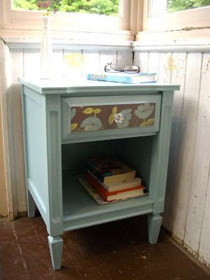
Lenore not only blogs but she also operates Lather Creations, a vintage furniture upcycling business. I absolutely love seeing how she transforms each of the pieces she gets her hands on. I've rounded up a few of my favourites...


Lenore is one talented gal and I've enjoyed getting to know her as a fellow blogger. You can visit her blog and Lather Creations here. I'm sure Lenore would love to have you pop over and say hello!

-Sarah

Puddle Jumpin' Fun & Sidewalk Chalk

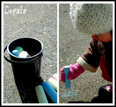
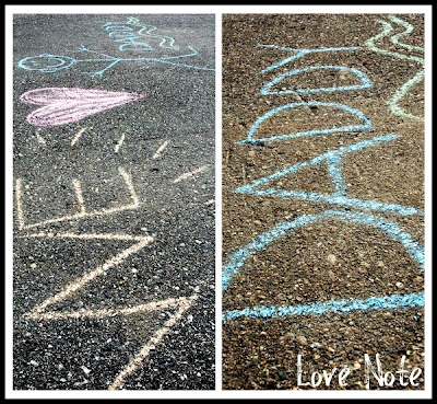
A few shots of a recent outdoor adventure. It's so cool how you don't even have to leave your front yard or driveway to have an "adventure" with kids. They can have fun anywhere!

(Click on images to enlarge)

Chalk on the Driveway


We Love You, Daddy!


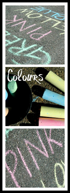
Learning Colours


Splash! Splash! Splash! (This was making baby Luke giggle so of course we had to do it over and over and over again.)


Just another day in the life of a busy mommy of two! Another day, another memory to cherish. 

-Sarah

Meal Plan (March 29-April 4)

Here's what I'll be cookin' this week...


Tuesday: Chicken Caesar Salad; Focaccia Bread 

Wednesday: Chicken Enchiladas; Nachos; Raw Veggies 

Thursday: Beet Borscht; Bread and Cheese 

Friday: Spinach Pizza; Tossed Salad 

Saturday: Beef on a Bun; Chips; Salad; Cherry Tarts with Whipped Cream  

Sunday: Omelets; Pancakes; Orange Wedges 

Monday: Fajitas; Nachos and Guacamole; Tossed Salad 


Making this list always makes me hungry!


-Sarah

Pretty Parcel

I've been anticipating the arrival of a few little pretties I recently ordered from Lenora at Prairie Blossoms. Lenora makes lovely jewelery. Some of her work reminds me a little of some of the Stella and Dot pieces out there but for a fraction of the cost. 

Lenora is so friendly to work with and her packages always arrive in the prettiest way. 


Lovely Packaging


Lovely Product 


You can read more about Prairie Blossoms here and visit Lenora's Etsy store here

And in case you wondered... it's exceptionally difficult to take pictures of your own ears!


-Sarah

Humphrey Ottoman Options

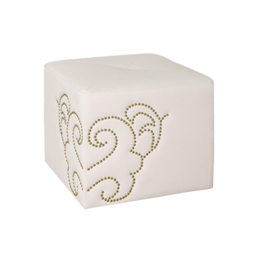
So, things are in the works with my DIY project based on the Humphrey Ottoman by Shine Furniture. I've decided on the size and my brother (who is going to be constructing it) has drawn up some plans on how he'll cut the pieces and put them together. We've agreed that it would be best for him to cut all of the sides which I'll then cover, and he'll put the covered pieces together. 

I was originally going to go with a white leather-looking vinyl to cover the ottomans, but now I'm having second thoughts. I've stumbled across a few colours and patterns that are really quite pretty. I'm curious to know what you think. Which of the following do you prefer?

#1 The original inspiration in white:


image via Peridot Decorative Homeware

Here are a few others I've seen recently. What do you think?

#2 A dark colour and perhaps a slightly textured fabric:
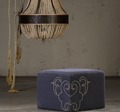
image via Shine Furniture

#3 A bright colour (like these turquoise ones at the end of the bed):
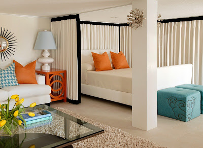
Room Design by Tobi Fairley

#4 A patterned fabric:

image via CUNEO & CO

So, I need your help. Leave me a comment to let me know which option you prefer. 

Again, here are the options to choose from:

1. White
2. Dark Colour (perhaps grey)
3. Bright Colour (like the turquoise)
4. Patterned Fabric

And of course if you have any other thoughts or suggestions I would love to hear them!

-Sarah

Headboard How-To

For today's post I'm going to share how we made the headboard in our master bedroom. I've mentioned a few details in previous posts but I'll go through it step by step today.


This headboard was the perfect solution for us at the time (we made it a few years ago) and we still like it. It was easy to make, fairly cheap and the look of it can be changed with a quick coat or two of paint! 


Here's the breakdown...

1. We decided on the size we wanted the headboard to be. The main thing was to determine the height of the headboard. We measured and then measured again to be sure. We decided we wanted the headboard to be 3 feet tall. 


2. Then, we made a trip to Home Depot and found the cheapest interior door we could that matched the dimensions we wanted. We wanted the headboard to be three feet tall so we found a door that was three feet wide. That was easy! $40 


NOTE: A "used" door could likely be found at a place like Habitat for Humanity or elsewhere. That would probably cut down on the cost! (Too bad I didn't think of this at the time.)


3. Next, we visited Canadian Tire and chose a paintable wallpaper we liked. We settled with the Floral Silhouette pattern they carry. $20/roll. (See image below for a very similar pattern.)


I particularly liked how the pattern of the paper matched the pattern on our lamp shades.


4. We stopped at General Paint and picked up a small can of dark grey paint. I wanted the grey to coordinate with the accent cushion I had recently found at Winners. The colour we chose was lead in a high gloss finish. $18


5. My husband cut the length of the door down to the size we wanted. We ended up taking 11" off the one end. 

6. We did some careful planning and more measuring. We put the door on its side, found the middle and drew a straight line across the width of the door. We lined up our first piece against this line. Four strips of paper covered the door. I've tried to illustrate what we did below. The corners were trimmed and neatly folded over the back. (Click on image to enlarge.)


7. After the paper had a chance to dry, I got to painting! I used a roller and put the paint on quite thick. Because the paintable wallpaper has texture to it you have to put the paint on thick to ensure that it covers completely. Two coats later I was done and we had a beautiful, one-of-a-kind headboard! 


James drilled four small holes into the back of the door and hung the headboard with four large srews and anchors. 

A stylish DIY headboard for $80! 

I particularly like the fact that the whole look can be changed with just a little paint. For more on that, read here

Happy Monday! 


-Sarah
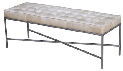
My Top 5 Benches

Yesterday I posted about why benches are so great and how they can be used in the home. That was all in preparation for today's top 5 round up... my top 5 benches.

There are so many lovely options out there but these 5 stood out to me.


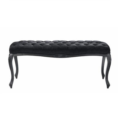
Maison Bench by Modern Dose


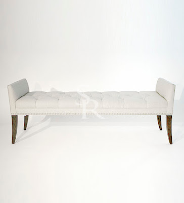
Liza Bench by Sarah Richardson Design

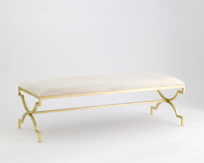
Sarah Bench by Jan Showers


Jonathan Bench by Oly
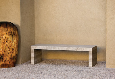
Sienna Bench by Stone Forest

This last bench can be used indoors or out. I love how it combines modern lines with an "earthy" look or finish. Beautiful!

I think my favourite was the third one down though (and not just because it has a great name). Such a glamorous look. The X-legs are a nice touch too and in the gold finish... gorgeous!
 
Did you have a favourite? Leave me a comment. I'd love to hear from you!


Enjoy your weekend!


-Sarah
Benches in the Home

For the past few Fridays I've been posting a top 5 furniture round up. I've done sofa styles, coffee tables and bar stools. This week's round up will be benches, but in preparation for that I thought I'd give you a few of my thoughts on why benches are so fabulous and how they can be used or placed in the home.

A bench is really quite a versatile piece of furniture. It can look great at the end of a bed, in place of a coffee table (some styles), in an entrance or hallway, in front of a fireplace as "extra" seating, as a substitute for a few chairs at a dining table, etc. The options are endless! I've included a few photos to give you a visual as to what I'm talking about and then the top 5 round up will follow tomorrow. I hope you enjoy and get some fresh ideas for your home. I know I'm now officially on the lookout for a lovely bench for our nest. 


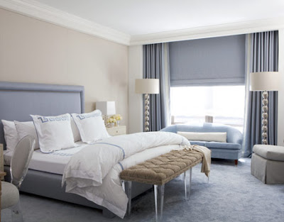
Bench at the Foot of the Bed: this looks nice and provides a good spot for dropping off extra pillows and blankets when it's time to sleep. You do need a larger space to pull this off though. (The lucite legs on this particular bench are quite stunning.)

House Beautiful

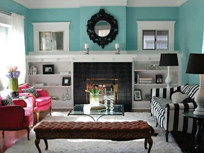
Bench in front of Fireplace: the space in front of the fireplace is no longer wasted space with a bench placed there. The bench provides extra seating or a place for those who are always cold to warm up by the fire! 

Elle Decor

Bench Used as a Coffee Table: this only works with certain styles of benches, but in the example below, the long rustic bench is the perfect pick for this space. It gives the room a casual feel, and because the bench is so long, it can be used by people at both ends of the room!

Via DecorPad

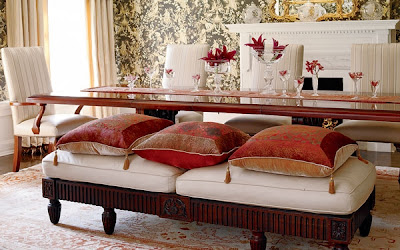
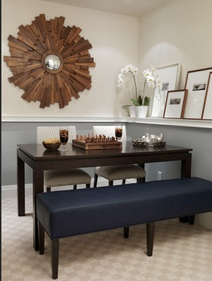
Bench used in place of dining chairs (two examples): notice there are dining chairs on the far side of the table but a bench on the near side. This gives a nice unexpected element and is perfect for when you need to squeeze in a few extra people at the table.


Via DecorPad
Sarah Richardson


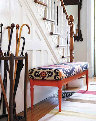
In an Entrance or Hallway: this provides a place for people to sit while lacing up their runners or pulling on their boots. Because a bench is generally quite narrow, it doesn't hinder the flow of traffic through the area.


Style at Home


Bench to Define a Space: here a bench provides extra seating and defines the living room area. Placing another sofa or two arm chairs there would have been too much. The bench is "light" and doesn't obstruct your view of the room but it fills the empty space; it's the perfect solution!


Nest Instinct via DecorPad


Like I mentioned, this was all in preparation for the top 5 round up that I hope you'll come back for tomorrow. I have 5 lovely finds to share!


-Sarah
Out and About

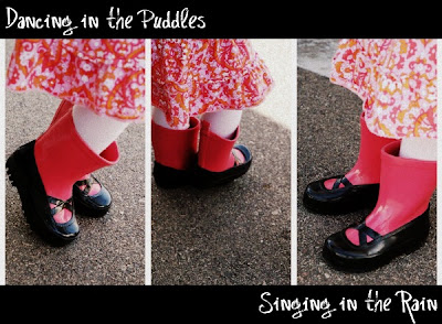
I ran into Old Navy the other day to pick up some rubber boots for Avery and myself. They were already quite picked over when I went so I simply had to go with what they had. Avery definitely came away with the cutest pair. Mine are... green and rubber. Their only redeeming quality is the sweet little buckle on the side of the boot. Anyway, we ventured outdoors earlier today and put our rubbers to the test. It was great to be outdoors!


My two favourite little people. (Luke isn't walking yet so he doesn't need rubber boots. He was content hanging out in the stroller.)


Love these kiddos! I'm so blessed and thankful to be their mommy.

-Sarah

Notes from Tommy Smythe

In a previous post I mentioned that I had heard Tommy Smythe speak at HomeStyles in Saskatoon and that I had taken some notes and wanted to share them with you. That's what I'll be doing today. 

One of first things Tommy Smythe said was that he has DADD (Designer Attention Deficit Disorder), meaning he likes to jump from this project to that project to this project to that project (you get the idea). If you feel like my recap jumps around it's probably because his talk jumped around a little, but it was completely enjoyable and I definitely learned some things. (It was a powerpoint presentation.)


One of the first things he showed us on the screen was what he calls the Triangle of Expectation (when doing a renovation).  He says you can never have all three points of the triangle at the same time. You always have to compromise one of the points; you have to decide which one it will be. For example, you can have good and fast but it won't be cheap. You can have something fast and cheap but it won't be good. Make sense? I thought this was a useful thing to know before embarking on a big reno project.


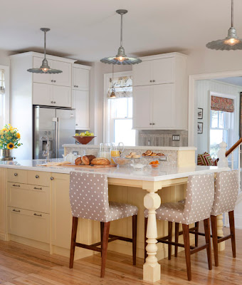
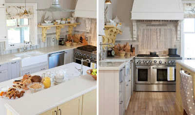
He showed us some photos of the kitchen at Sarah's Farm and said that all the cabinetry was IKEA. Wow! 


Via HGTV


Via HGTV


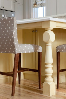
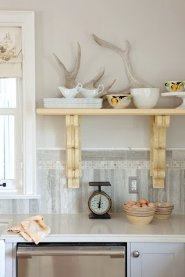
He then pointed out how they added some unique elements like the old finial post on the one corner of the island and the vintage shelf brackets. These few elements really give the space character and make the kitchen look more like a farmhouse kitchen. Brilliant! 


Old Finial Post

Antique Brackets


Another great idea I picked up was to put two twin beds together end to end in a kid's room where two children share the space. 


Instead of me trying to explain what he meant by this have a look at the photo below. (Sorry the photo is so small. It was the only one I could find.) Tommy and Sarah Richardson had a platform built in against the back wall of the room and set two twin mattresses on top end to end. It's a great use of space and it gives each of the girls their own bed although they are still really sharing the bed. They can either sleep toe to toe or head to head. What a great design especially as a solution for a small shared space!


Another fun tip I picked up was to number guest towels so it's easy to keep straight which towels belong to who. If you're number 3 then you know that any towel with that number is yours whether that be a bath towel, hand towel, or face cloth. Doing this could also cut down on the amount of laundry needing to be done when there are several guests over.


And a few random tidbits in closing...
  • Use green as a neutral.
  • Be inspired by your surroundings - the outdoors (colours, textures, etc.)
  • Use "light" or open lighting for a space that you look through (for example, if you look through your dining area from your kitchen into the living room then choose a light fixture that doesn't obstruct your view too much). 
  • Decorate your hallways: hang something from the ceiling, put up a chair rail and paneling, hang art, window dressings, etc. 
  • Mix rough and fine elements.
Oh, and did you ever wonder how they lit the candles on the chandelier in Sarah's cottage dining room? Well, I guess the chandelier (that's probably not the correct term for it) is on a pulley that can be used to lower the candles to be lit and then raised to give light to the whole space. Lovely!


That sums up Tommy's DADD presentation or at least the parts of it that I took special interest in. It was great to hear him speak and to learn from one of the best! 


-Sarah